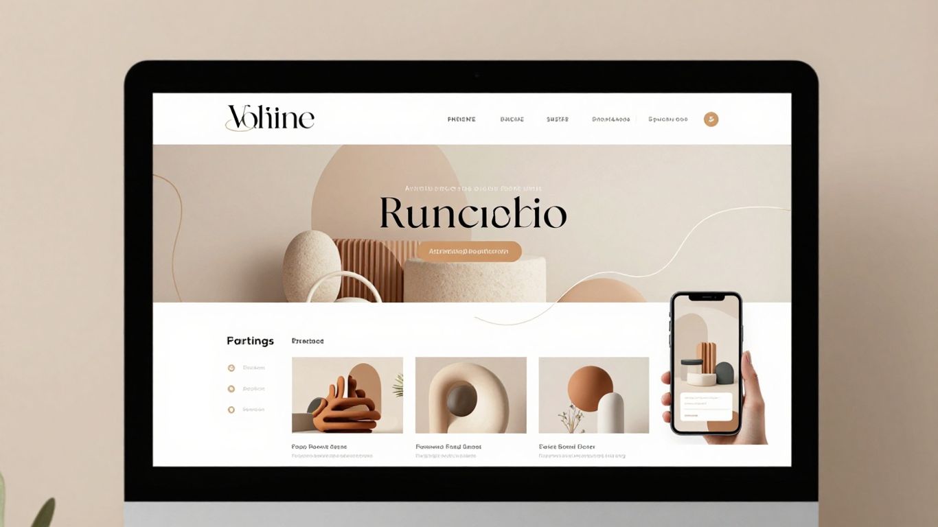
Web design trends 2026: A practical guide to the ideas shaping modern websites
What is driving web design trends in 2026
Web design trends 2026 are being shaped by more than visual taste. We are responding to faster technology, changing search habits, stricter expectations around privacy, and a wider range of devices and abilities. The strongest work brings these pressures together without making the interface feel complicated. For us, the central question is simple: does each design decision help people understand, trust, and use the website?
How AI is changing research, design, and content workflows
AI is becoming part of the working process rather than a replacement for design judgment. We can use it to sort research themes, explore layout directions, draft content variations, or identify gaps in a content structure. That speed gives teams more room to test ideas, but it also makes review more important. We still need to check facts, remove generic language, and make sure the final interface sounds like the organization behind it.
AI is most useful when we give it a clear brief and a defined design system. Components, type scales, spacing rules, and content standards help keep experimentation coherent. Without those boundaries, a fast workflow can produce a collection of polished screens that do not work together.
Why user trust matters more in automated experiences
Automation can make a website feel helpful, but it can also make decisions feel hidden. People want to know why content has changed, what information is being used, and when they are interacting with a machine rather than a person. We can build trust by explaining actions in plain language, offering sensible defaults, and keeping an easy path to human assistance where it is needed.
The visual layer matters here too. Familiar controls, readable status messages, and consistent interaction patterns reduce uncertainty. A confident design does not pretend to know everything; it gives users enough context to make their own choices.
The role of privacy, sustainability, and inclusive design
Privacy, sustainability, and inclusion are increasingly connected to everyday design decisions. A website that collects less information, loads fewer resources, and works for more people is often easier to understand as well. We should treat these qualities as part of the experience, not as technical checks added after the visual work is finished.
This affects everything from consent wording to font selection and image handling. Clear choices are kinder than dark patterns, and efficient pages are more usable on older devices or slower connections. Good design reduces friction without asking people to surrender unnecessary control.
How changing search behavior affects website structure
People now find answers through search summaries, voice interfaces, social platforms, and recommendation systems as well as traditional result pages. That means a website needs strong page structure before it needs decorative effects. Clear headings, descriptive links, useful page titles, and focused sections help both people and machines understand what a page contains.
We should also design for visitors who arrive deep inside a site. A well-structured page explains its subject without requiring a journey from the homepage. Related content, visible context, and purposeful calls to action help users continue when a search result has skipped the usual introduction.
Immersive visual design is becoming more intentional
Visual richness is returning, but the best examples are not simply adding more decoration. They use scale, contrast, texture, and movement to guide attention. We can create a memorable interface while keeping the underlying hierarchy calm and legible. The test is whether the visual idea gives the content a clearer role.
Editorial layouts that create stronger visual hierarchy
Editorial layouts borrow from magazines, posters, and long-form publishing. Large headlines, asymmetric columns, generous margins, and carefully placed images can give a page a deliberate rhythm. This approach works particularly well when the content has a clear narrative or when we need to help readers move between short and long sections.
The layout still needs a dependable reading path. We should establish the relationship between headline, supporting text, navigation, and action before experimenting with unusual alignment. A dramatic opening can attract attention, but consistent spacing and type styles carry readers through the rest of the page.
Organic shapes, layered compositions, and expressive typography
Soft curves, irregular forms, and overlapping layers can make a digital interface feel less rigid. Expressive typography adds personality, especially when it is paired with a restrained body style that remains easy to read. These elements are useful when a brand needs warmth or a sense of craft rather than a purely functional appearance.
We should avoid treating organic form as a substitute for structure. Shapes need to support grouping, separation, or emphasis. Type also needs practical rules: a display face may appear in headings, while a more neutral family handles navigation and longer passages.
Strategic use of 3D graphics, textures, and depth
Three-dimensional objects, grain, shadows, and layered surfaces can help users understand a product or create a stronger sense of place. They can also make a page distinctive when flat color and photography do not express the intended character. Used carefully, depth establishes a visual order between a foreground action and supporting material.
The cost is complexity. Heavy assets, excessive shadows, and elaborate scenes can slow a page or compete with its message. We should begin with one clear visual purpose, then test whether a lighter treatment communicates the same idea.
When bold visuals improve a brand experience—and when they distract
Bold visuals are most effective when they are tied to a real quality of the organization, product, or story. They may help a creative portfolio feel energetic or help a product page make physical details easier to understand. They distract when they force users to decode the interface before they can complete a basic task.
We can evaluate the balance by temporarily removing the decorative layer. If the page loses only atmosphere, the treatment may be appropriate. If users lose the ability to find, read, or act, the design needs a clearer foundation.
AI-powered personalization is reshaping user experiences
Personalization is moving beyond a name in a welcome message. Interfaces can respond to context, intent, previous actions, and the kind of help a visitor appears to need. That flexibility can shorten the path to a useful answer, but it also creates new responsibilities around accuracy and consent. We should make changes understandable rather than making the page feel unpredictable.
Adaptive content based on user intent and behavior
Adaptive content can change the order, emphasis, or format of information according to a user’s needs. A returning visitor may benefit from a direct route to the next step, while a first-time visitor may need more explanation. These variations should be grounded in a clear purpose, not in an attempt to personalize every visible detail.
We should preserve a stable core. Navigation, labels, and essential information should not shift so much that people lose their bearings. A useful adaptive interface feels responsive while remaining familiar.
Conversational interfaces beyond basic chatbots
Conversational design is becoming part of search, support, onboarding, and product exploration. A good conversational interface asks focused questions, explains what it can do, and offers a practical fallback when the request is unclear. It should not force people into a chat when a direct form or visible answer would be faster.
The language needs careful attention. Short prompts, clear confirmations, and visible conversation history help users understand what has happened. We also need to design for correction, because people regularly change their minds or phrase the same request in different ways.
Generative visuals and copy with human oversight
Generative tools can help teams explore visual directions and produce early content variations. They are most valuable at the concept stage, where we can compare possibilities quickly. Before anything reaches a public page, we need to review the accuracy, tone, accessibility, and originality of the result.
Human oversight is not just a final approval step. It includes setting the brief, defining what should never be changed, and checking whether the output fits the design system. A generated headline that sounds impressive but obscures the action is still a poor headline.
Balancing personalization with consent and data privacy
Personalization becomes uncomfortable when users cannot tell why an experience has changed. We should explain relevant data use, request permission where required, and avoid collecting information simply because it might be useful later. People also need a way to adjust or refuse personalization without losing access to the basic service.
The safest approach is usually proportionate. Use the least sensitive information that can solve the design problem, keep retention limited, and make the settings understandable. Trust grows when the interface gives people meaningful control rather than hiding it in a dense policy page.
Motion and interaction are becoming core design tools
Motion can explain relationships that static screens leave unclear. A panel can expand from its trigger, a confirmation can appear where an action occurred, and a sequence can guide attention through a complex idea. We should treat animation as part of communication, not as a layer added for spectacle. Its timing and movement need to support the user’s task.
Scroll-based storytelling that supports navigation
Scroll-based storytelling works when the page reveals information in a logical order. It can introduce a process, compare stages, or connect a visual to a short explanation. The scroll should remain a familiar control, not become a test of patience or precision.
We should give users clear progress cues and avoid trapping them in an animation. The content should remain understandable if motion is reduced, interrupted, or experienced on a small screen. A compelling sequence is still a navigation pattern, so it needs landmarks and a destination.
Microinteractions that clarify feedback and status
Small responses can answer important questions: Did the form submit? Was the item saved? Is the content still loading? A change in color, position, or label can reassure users when it appears at the right moment. These details make an interface feel responsive without demanding attention.
We should reserve motion for meaningful state changes. A button that shifts constantly may look lively but can make the page feel unsettled. Clear copy and a visible status are usually more valuable than a decorative animation attached to every control.
Cursor effects, hover states, and responsive transitions
Cursor effects and hover states can reveal secondary information or make desktop interactions feel more tactile. Responsive transitions can also help users understand how one view relates to another. These patterns work best when the default state already communicates the essential action.
Hover cannot be the only way to discover information because touchscreens and keyboards do not provide the same behavior. We should provide an equivalent focus, tap, or visible state. Transitions should be quick enough to preserve momentum and restrained enough not to obscure content.
Performance and accessibility limits for animated interfaces
Animation can affect people who experience motion sensitivity, cognitive fatigue, or slower devices. It can also increase script work and delay the content users came to see. We need to offer reduced-motion behavior, avoid unnecessary parallax, and ensure that movement never blocks an essential action.
Testing should include real devices and varied input methods. If an effect creates a polished impression in a design file but causes a page to stutter in use, it is not serving the experience. The most successful motion is often the motion users barely have to think about.
Accessibility and usability are becoming design differentiators
Accessibility is not separate from visual design or usability. It shapes the way we choose type, structure content, define states, and test components. When an interface works for a broader range of people, it often becomes clearer for everyone. That clarity is a genuine quality difference, especially on busy websites.
Designing for keyboard navigation and assistive technology
Keyboard users need a visible focus state, a sensible order, and access to every important control. Screen reader users need meaningful headings, labels, alternative text, and feedback that is announced in a useful way. We should build these needs into components instead of trying to patch them into finished screens.
A component library can make this work more consistent. When buttons, dialogs, fields, and menus share tested behaviors, teams are less likely to recreate inaccessible versions in different parts of the site. We still need to test the assembled page because context can change how a component works.
Color contrast, readable typography, and reduced motion
Readable type depends on more than font size. We need suitable contrast, comfortable line length, enough spacing, and a hierarchy that does not rely on color alone. Type choices should also account for the environment in which people read: small screens, bright rooms, and imperfect displays are common.
Reduced-motion preferences should be respected throughout the interface, not only on the homepage. We can replace moving transitions with a quick opacity change or no animation at all. The goal is not to remove personality but to avoid making personality a barrier.
Clear information architecture for faster task completion
People should not need to understand an organization’s internal structure to find a page. We can group content around user goals, use labels that match familiar language, and show where a person is within a larger journey. Search, navigation, and page headings should reinforce one another.
A useful information architecture is visible in the details. Related links should be genuinely related, calls to action should describe their destination, and long pages should offer enough signposting to support scanning. Clarity reduces the need for repeated navigation and repeated explanation.
Using inclusive research to avoid one-size-fits-all experiences
Inclusive research means listening to people with different abilities, devices, languages, levels of confidence, and circumstances. We should not assume that a smooth experience for one team member represents the audience. Short usability sessions, observation, and feedback from assistive technology users can reveal problems that analytics cannot explain.
The findings should influence components and content rules, not just individual screens. When we document what different users need, those lessons can travel into future work. Inclusion becomes more durable when it is part of the design system and delivery process.
Performance-first design is shaping modern websites
A visually ambitious website still needs to respond quickly. Performance affects whether people can read, navigate, and act, particularly on mobile devices or inconsistent networks. We should treat speed as a design constraint from the first concept rather than asking developers to solve it after the visual direction is fixed.
Core Web Vitals and the impact of visual complexity
Core Web Vitals provide useful signals about loading, interactivity, and visual stability. They do not replace user testing, but they help us see when a page’s structure is putting too much pressure on the browser. Large images, delayed scripts, shifting content, and layered effects can all affect the experience.
A performance review should happen alongside a visual review. When we compare the expressive benefit of an effect with its cost, we can decide where richness matters most. A focused hero treatment is often more valuable than a heavy effect repeated across every section.
Lightweight media, responsive images, and efficient code
Images should be sized for their display context rather than delivered at the largest possible resolution. Modern formats, responsive sources, and lazy loading can reduce unnecessary work, while careful font loading prevents typography from delaying the page. We should also remove scripts and styles that no longer support a real feature.
These choices need coordination between design and development. A component should define sensible media behavior, not assume that every image has the same dimensions or importance. Efficient code is easier to maintain when the interface has clear rules.
Mobile-first layouts for inconsistent network conditions
Mobile-first design is not only about shrinking a desktop layout. It asks us to identify the essential content, prioritize the main task, and make controls comfortable at a smaller size. We should also consider what happens when images are delayed, data is limited, or the connection disappears briefly.
A resilient layout keeps its structure while assets load. Text should remain readable, actions should stay discoverable, and important information should not depend on a background video. Designing for imperfect conditions usually makes the experience more dependable everywhere.
Sustainable design choices that reduce resource usage
Resource-conscious design can begin with modest decisions: fewer decorative assets, shorter pages where appropriate, efficient media, and restrained animation. We can also avoid loading a library or font family that serves no clear purpose. A lighter page is often faster, easier to maintain, and less demanding on devices.
Sustainability should not become an excuse for a dull interface. It is a prompt to spend resources where they improve understanding or utility. By measuring what the page needs and removing what it does not, we create room for the details that matter.
New interface patterns are changing how people navigate
Navigation is expanding beyond menus and links. Voice input, gestures, spatial environments, modular content, and automated answers all influence how people reach information. We should design these patterns as extensions of a clear structure, not as reasons to abandon familiar controls. People still need orientation, feedback, and a reliable way back.
Voice, gesture, and multimodal interactions
Voice can help users search, dictate, or complete tasks when typing is inconvenient. Gestures can make maps, media, and visual tools more direct. Multimodal interfaces combine these inputs with touch, typing, and visual feedback so users can choose the method that suits the moment.
Each mode needs a visible equivalent where possible. We should not hide a critical action behind a gesture that some users cannot perform or recognize. Clear prompts, confirmation states, and alternative controls keep the experience understandable across devices.
Spatial interfaces and immersive web experiences
Spatial interfaces can place content around a user rather than presenting everything as a flat sequence. This may be useful for exploring objects, environments, or complex relationships. It also introduces questions about orientation, comfort, device capability, and the amount of attention the experience demands.
We should provide a straightforward two-dimensional route to the same essential information. Spatial depth can enrich a journey, but it should not become the only way to complete a task. Progressive enhancement keeps the experience useful when advanced hardware or high bandwidth is unavailable.
Modular sections that adapt across devices and contexts
Modular design helps us reuse a content idea without forcing every screen into the same arrangement. A feature may appear as a wide composition on desktop, a stacked block on mobile, or a shorter summary in a search-oriented context. The content remains related, while its presentation responds to the situation.
Good modules have clear boundaries and a defined purpose. They should not be assembled into a page simply because the pieces exist. Content priorities, spacing, and typography need to remain coherent when modules are rearranged.
Designing for search summaries, agents, and no-click journeys
Some visitors may receive enough information from a search summary or an automated agent that they do not immediately open a page. That makes concise, well-structured source content more valuable. We should state key facts clearly, answer common questions directly, and provide deeper context for people who need it.
A no-click journey does not make a website irrelevant. It changes the role of the website from being the only answer to being a trustworthy source, a place for detail, and a route to action. Clear authorship, accurate content, and useful page structure support all three roles.
How to apply web design trends without chasing every trend
Trends can help us notice new possibilities, but they are not a redesign strategy. We need to connect each idea to an audience need, a business purpose, and a measurable improvement in the experience. This keeps the work current without making it feel borrowed. A practical process also protects teams from spending months polishing a pattern that never solves a real problem.
Separating lasting principles from short-lived aesthetics
Some changes are visual fashions, while others reflect durable shifts in technology or behavior. A color treatment may pass quickly, but readable type, clear feedback, and fast loading remain useful. We can experiment with the surface while keeping the underlying system stable.
A useful test is to ask what would remain valuable if the trend disappeared next year. If the answer is better hierarchy, easier navigation, or more meaningful feedback, the idea may have a lasting foundation. If it depends entirely on novelty, we should contain it rather than build the whole site around it.
Evaluating trends against business and user goals
Every proposed pattern should have a job. We can ask which audience problem it addresses, what action it should support, and how we will know whether it helped. The answer may be qualitative, such as improved comprehension, or behavioral, such as fewer failed form attempts.
This evaluation also keeps the design system healthy. A pattern that works for one campaign may not belong in a core component library. We should distinguish between an intentional one-off and a reusable rule before investing in implementation.
Testing new patterns with prototypes and analytics
Prototypes let us test hierarchy, movement, and language before the cost of a full build. We can put a realistic task in front of users and watch where they hesitate, misread a control, or miss the next step. Analytics can then help us understand whether the issue appears across a wider audience.
Neither method is enough alone. Numbers can show where a journey breaks, while observation helps explain why. We should combine both, make one change at a time where possible, and record what we learned so future decisions are based on evidence rather than memory.
Creating a practical roadmap for a 2026 website redesign
A redesign roadmap should begin with the current experience, not a collection of inspirational screenshots. We can inventory content, identify the most important journeys, review performance and accessibility, and map the components that need attention. From there, the team can choose a small number of improvements with a clear order of work.
A practical sequence might look like this:
- Establish content, accessibility, and performance baselines.
- Define the type scale, spacing system, color roles, and core components.
- Prototype the highest-value journeys on mobile and desktop.
- Test with representative users and refine before wider rollout.
This sequence leaves room for visual ambition while protecting the foundations. We can introduce expressive layouts, personalization, or motion where they earn their place, then measure the result after launch. The roadmap becomes a way to make deliberate choices rather than a race to include every web design trend 2026 has produced.
Conclusion
The strongest web design work in 2026 will not come from copying the most noticeable visual trend. We will create better websites by combining expressive design with readable typography, accessible components, useful motion, careful personalization, and dependable performance. When every choice serves a real user need, a modern interface can feel distinctive without becoming difficult to use.
Frequently Asked Questions
What are the biggest web design trends 2026?
The major themes include intentional immersive visuals, AI-assisted experiences, meaningful motion, inclusive design, performance-first development, and navigation that works across new devices and search contexts. Their value depends on how well they support users and content.
Should every website use animation?
No. Animation is useful when it explains feedback, hierarchy, or movement through an interface. If it slows the page, distracts from content, or causes discomfort, a simpler transition or static state is usually better.
How can we use AI in web design responsibly?
Use AI to explore, organize, and speed up parts of the workflow, then review every important output for accuracy, tone, accessibility, and privacy. Human judgment should set the purpose and approve what reaches users.
Why is typography so important in modern website design?
Typography controls reading comfort, hierarchy, rhythm, and the perceived character of a page. A clear type system helps users scan content and gives different components a consistent relationship across devices.
What does performance-first design mean?
It means treating loading speed, responsiveness, and visual stability as design requirements from the beginning. Media, fonts, animation, scripts, and layout decisions are chosen with the user’s device and network conditions in mind.
How do we make a website more accessible?
Start with semantic structure, keyboard access, visible focus states, readable contrast, clear labels, alternative text, and support for reduced motion. Test with different people and technologies rather than relying only on automated checks.
How should we decide whether to follow a design trend?
Connect the trend to a specific user or business goal, prototype it, and test whether it improves the experience. Keep the pattern when it creates lasting value, and leave it out when novelty is its only benefit.