Web design trends 2026: A practical guide to what’s changing
How AI is reshaping website experiences
AI is changing how teams explore ideas and tailor digital experiences, but it works best as part of a considered design process. For web design trends 2026, the more useful question is not whether a site uses AI; it is whether the experience feels relevant, clear, and trustworthy. We can treat these tools as a way to test possibilities while keeping the visitor’s needs at the centre.
Personalization that adapts to visitor needs
Personalization can make a website feel more helpful when it responds to what a visitor is trying to do. A returning reader might benefit from a clear route back to useful material, while a first-time visitor may need more context before choosing a next step. We should keep those adjustments modest and understandable, so the interface remains familiar rather than seeming to change without explanation.
AI-assisted content and interface creation
AI can help teams draft, explore, and refine content or interface ideas, giving us more options to review during early design work. It is still our job to check whether each suggestion is accurate, readable, and consistent with the purpose of the page. A useful workflow treats generated material as a starting point, not finished design. We can review it against a few practical questions:
- Does the content answer the visitor’s likely question?
- Is the language clear and specific to this page?
- Does the proposed interface work with the existing components?
- Can a person review and correct the result before it goes live?
These checks help keep speed from becoming an excuse for generic copy or confusing patterns. The goal is a page that serves people, not one that merely looks newly generated.
Keeping human judgment in the design process
Design decisions involve context that a tool may not have: the importance of a particular task, the history of a brand, or the point at which a visitor might feel uncertain. We bring that understanding to the work by reviewing outputs, testing prototypes, and deciding what to leave out. Human review keeps the experience intentional when automation makes it easy to produce more than a page needs.
Privacy and transparency in AI-powered experiences
If an experience adapts using visitor information, we should be clear about what is being used and why. Collect only information that supports a real purpose, and avoid interactions that make personalisation feel hidden or intrusive. A straightforward explanation and a sensible choice can help visitors understand what to expect without interrupting the whole journey.
Why expressive visuals are gaining ground
Visual design can give a website a distinct character before a visitor has read much of its content. Typography, colour, and composition all shape how a page feels, but they also need to help people understand where to look and what to do. The strongest expressive choices are not decoration added after the fact; they support the story the page is telling.
Bold typography as a core design element
Large or characterful type can establish hierarchy and set a clear tone, especially on a landing page or editorial feature. We should pair expressive headlines with readable body text and a sensible range of sizes, so personality does not come at the cost of comprehension. A component library can help keep those choices consistent across page types while still allowing room for a distinctive headline.
Color, gradients, and visual contrast
Colour can distinguish sections, guide attention, and contribute to a recognisable visual identity. Gradients may add depth or warmth, but they should not make text harder to read or obscure interactive elements. We can check foreground and background combinations in their actual layout, rather than assuming a palette works because its swatches look appealing side by side.
Editorial layouts that prioritize storytelling
Editorial layouts give content room to unfold, using pacing, images, captions, and changes in scale to make a long page easier to follow. We can use a strong opening, clear subheads, and varied but consistent blocks to help readers understand how one idea leads to the next. The layout should make the story easier to enter, not turn reading into a puzzle.
Using distinctive visuals without sacrificing clarity
A bold visual system still needs familiar cues: readable navigation, legible labels, and clear actions. When a page includes unusual shapes or asymmetrical composition, we should make sure visitors can still scan it and find the next step. Testing the design at different sizes often reveals where a striking detail is taking attention away from the content.
How motion and interaction are evolving
Motion can make an interface feel responsive, but every animated detail asks for some of the visitor’s attention. We can use movement to clarify a change, show a relationship, or give feedback after an action. When it exists only to impress, it can slow the page down and distract from the task.
Subtle animations that guide attention
A restrained transition can help explain that a menu has opened or that a section has changed state. We should keep timing and movement consistent, so the page feels coherent rather than busy. Small cues are usually enough; the interaction should remain understandable if someone does not notice the animation at all.
Scroll-based storytelling and transitions
Scroll-based effects can pace a narrative by revealing content as a visitor moves through a page. They work best when the order of information remains clear and the page does not take control away from the reader. We should preserve access to the content for people who move quickly, use keyboard navigation, or browse on a device where elaborate effects are less comfortable.
Microinteractions that clarify interface feedback
Microinteractions are small responses to actions, such as a button changing state after a click or a form field indicating an error. Their purpose is to confirm what happened and what the visitor can do next. When we design these details as part of a shared component system, similar actions can provide similar feedback across the site.
Reduced-motion options and performance trade-offs
Motion needs to be considered alongside comfort and page performance. We can offer reduced-motion behaviour and avoid making essential information depend on an animation. It also helps to review the number and complexity of effects on a real device; a transition that feels light in a prototype may become cumbersome in a fuller page.
Where immersive and three-dimensional design fits
Three-dimensional details can make a product, place, or idea easier to explore, but they are not automatically an improvement. Their value depends on whether they help visitors understand something that a simpler image or diagram would not. We can start with the purpose of the page and use immersive elements only when they add useful context.
3D elements that support a page’s purpose
A 3D element may help someone inspect shape, form, or spatial relationships. Before adding one, we should ask what visitors need to learn from it and whether the same information can be communicated more simply. A purposeful interaction should have a clear starting point and controls that are easy to discover.
Layered depth and spatial navigation
Layers, shadows, and overlapping content can create a sense of depth without requiring a fully three-dimensional scene. Used with care, they can separate related elements and make navigation easier to parse. We should avoid using depth as the only way to communicate hierarchy, since visitors need clear labels and a reliable structure as well.
Designing immersive experiences for mobile
On mobile, an immersive feature must work within a smaller screen, touch-based controls, and varied connection conditions. We can simplify gestures, make controls easy to reach, and keep important information visible without requiring precise movement. A compact fallback can also preserve the page’s main purpose if the full experience is not practical on a particular device.
When simpler visuals are the better choice
A static image, a short explanation, or a well-organised set of product details may be clearer than an elaborate scene. Simpler visuals can also help keep the interface quick to load and easier to maintain. We should choose the least complicated treatment that gives visitors the understanding they came for.
How accessibility and performance shape modern design
A polished website needs to work for people using different devices, input methods, and settings. Accessibility and performance are not finishing touches; they influence layout, content, motion, and component decisions from the beginning. When we account for them early, the result is often clearer for everyone.
Building accessible layouts and interactions
Accessible layouts use readable text, meaningful structure, and controls that can be identified and used in more than one way. We should make keyboard paths clear, ensure interactive states are visible, and avoid relying on colour alone to explain a status. These choices are easier to maintain when they are built into reusable components instead of handled as exceptions on individual pages.
Improving load times for media-rich pages
Images, video, animation, and interactive elements all contribute to the weight of a page. We can choose media based on what the content needs, prepare it for the space where it will appear, and avoid loading elaborate assets before they are useful. A faster page is not achieved by removing all visual character; it comes from making deliberate choices about what earns its place.
Designing for different devices and connection speeds
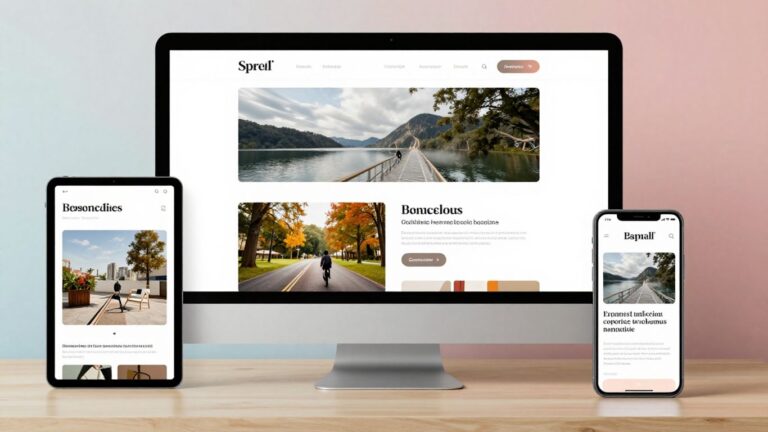
Responsive design is more than shrinking a desktop layout. We should consider how content reflows, how controls behave with touch, and which assets are essential when a visitor has a slower connection. Testing at different screen sizes helps us find awkward wrapping, crowded controls, or sections that become difficult to navigate.
Testing usability with real people
A design can look orderly to its creators and still leave visitors unsure where to begin. We can learn from watching people try common tasks, listening to where they hesitate, and noting what they expect an unfamiliar control to do. Those observations give us a practical basis for revising the interface instead of relying only on personal preference.
How to choose trends that suit your website
A trend is a design option, not a requirement. We can decide whether it belongs by considering the audience, the job the website needs to do, and the resources available to support it over time. That approach keeps new ideas connected to real needs rather than turning a site into a collection of fashionable effects.
Matching design choices to audience and goals
Start with the visitor’s task and the page’s purpose. A content-heavy site may benefit from strong hierarchy and easy scanning, while a focused campaign page may have more room for visual experimentation. We should choose patterns that make the intended journey clearer, especially at the moments where visitors need to compare, understand, or act.
Evaluating trends against brand identity
A visual trend can be adapted to a brand, but copying its most noticeable surface details may make a site feel out of place. We can look at existing typography, tone, colour, and component patterns, then decide whether a new idea strengthens or blurs them. Consistency does not mean every page must look identical; it means the choices feel like they belong together.
Prototyping and measuring design changes
A prototype lets us explore a layout or interaction before committing to a full build. We can use it to check hierarchy, content flow, and whether an unfamiliar pattern is understandable. After a change is in place, we should review it against the original goal and observe how people use it, rather than assuming that novelty alone means success.
Planning for maintainability and long-term use
Every new visual treatment or interaction adds decisions that a team may need to support later. We should consider whether it can be implemented consistently, updated without unnecessary effort, and used across the pages where it makes sense. A small set of well-considered components can leave room for expression while keeping the site manageable.
Conclusion
The most useful web design trends 2026 are not necessarily the most dramatic ones. We can take inspiration from AI, expressive visuals, motion, and immersive design while keeping accessibility, performance, and the visitor’s purpose in view. When we test ideas against those basics, our websites can feel current without becoming harder to use or maintain.
Frequently Asked Questions
What are the main web design trends for 2026?
Common themes include AI-assisted workflows, expressive typography and colour, purposeful motion, immersive visuals, and a stronger focus on accessibility and performance. Which ones matter most depends on the needs of each website.
How do we decide whether a design trend is right for our website?
We can compare it with the site’s audience, goals, and existing visual identity. A trend is worth exploring when it helps visitors understand content or complete a task more easily.
Is AI replacing web designers?
AI can support parts of the design process, such as generating options or helping teams explore content. Human judgment remains essential for setting priorities, evaluating context, and deciding whether an idea is appropriate.
Should every website use animation?
No. Animation is useful when it clarifies a change or guides attention, but it can be distracting or unnecessary. A page should remain understandable without relying on motion.
Are 3D elements suitable for every kind of website?
No. Three-dimensional elements make sense when they help visitors explore information that is difficult to communicate with simpler visuals. Otherwise, a clear image or layout may work better.
How can we make a visually expressive website accessible?
We can pair distinctive design choices with readable text, clear structure, visible interactive states, and keyboard-accessible controls. Testing across devices and with different users helps uncover barriers.
How often should we update a website’s design?
There is no single schedule that suits every site. We can review the design when visitor needs, content, technology, or business goals change, and make updates based on observed problems rather than trend cycles alone.