Web design trends 2026: 7 shifts shaping the future of websites
1. AI-powered experiences become more useful and personal
AI is moving from a novelty tucked into a website to a quieter part of the interface. Rather than asking visitors to learn a new tool, we can use it to reduce friction around familiar tasks such as finding information, comparing options, or choosing where to go next. The strongest web design trends 2026 will make these experiences feel useful without allowing automation to take over the whole journey.
Generative interfaces that adapt to user intent
A generative interface can change the way information is presented according to what someone is trying to do. A visitor who wants a quick answer may need a compact summary, while someone comparing options may benefit from a fuller set of details. We should design these variations within a recognisable structure, so the interface feels responsive rather than unpredictable.
This calls for flexible components, clear content priorities, and sensible fallback states. The design system still provides the boundaries: familiar controls, readable typography, and predictable ways to move backwards or start again.
AI-assisted search, navigation, and recommendations
Search can become more helpful when it understands natural questions instead of relying only on exact keywords. Navigation can also guide people towards relevant sections when a site contains a large amount of content. Recommendations work best when they explain their relevance and remain easy to dismiss.
The interface should make the next action obvious without making the user feel funnelled into it. Labels such as “related information” or “based on your selection” give people useful context and help them judge whether the suggestion is worth following.
Personalization without sacrificing user control
Personalisation should make a website more relevant, not more mysterious. We can remember a selected preference, reorder useful content, or offer a shorter route through a task, but people should still be able to change those choices. Controls for editing, resetting, or skipping personalisation deserve the same care as the primary interaction.
A restrained approach also protects the visual rhythm of the page. We can adapt content while keeping the same typographic hierarchy, spacing rules, and component behaviour, which makes the experience feel coherent across visits.
Managing accuracy, transparency, and trust
When AI contributes to an experience, we need to show where uncertainty exists. A confident answer that is incomplete can create more work than a clear request for clarification. Interfaces should distinguish generated guidance from fixed information, provide routes to source material where appropriate, and make correction possible.
We can also design for graceful failure. If an automated response is unavailable, a well-written empty state and ordinary search or navigation path should still help the visitor continue.
2. Motion design focuses on feedback and storytelling
Motion is becoming less about decoration and more about explaining change. A small transition can show where content came from, while a carefully timed response can reassure someone that an action worked. We should treat movement as part of the interaction language, not as a layer added after the layout is complete.
Scroll-based effects that guide attention
Scroll effects can establish sequence, reveal supporting detail, or help people understand a long narrative. They are most effective when the movement follows the content rather than competing with it. A modest shift in depth or position can be enough to signal that a new idea is entering the page.
We should avoid tying essential information to a particular scroll speed or pointer position. Every important message needs a stable, readable version that remains available when motion is reduced or the screen is small.
Microinteractions that clarify user actions
Buttons, fields, toggles, and menus benefit from immediate feedback. A pressed state, an inline validation message, or a visible change after saving tells people that the interface has understood them. These details are especially valuable in forms, where silence can make users repeat an action or abandon it.
Good microinteractions are brief and specific. They do not need to draw attention to themselves; they simply close the gap between an action and the system’s response.
Dynamic transitions between pages and states
Page transitions can preserve context when a visitor moves between related views. A panel that expands from its trigger, for example, helps people understand what has changed and how to return. Similar logic applies to loading states, filters, and multi-step tasks.
We should choose transitions according to the relationship between states. A quick fade may suit a replacement, while a directional movement may suggest progression. Consistency matters more than spectacle.
Keeping animation accessible and performance-friendly
Animation needs an off switch and a sensible workload. We can respect reduced-motion preferences, avoid rapid flashes, and make sure moving elements do not hide essential controls. The same experience should remain understandable when transitions are shortened or removed.
Performance is part of the design decision too. Lightweight transforms and restrained timing usually communicate more effectively than a page filled with simultaneous effects.
3. Websites embrace richer visual expression
Many interfaces are moving beyond interchangeable cards and spacious white backgrounds. Designers are using typography, colour, depth, and composition to give a website a clearer point of view. Richer expression can make a page memorable, but it still needs a firm underlying structure.
Editorial layouts with bold typography
Editorial layouts bring hierarchy to the foreground. Large headings, deliberate line lengths, pull-out details, and varied scales can make a page easier to scan when they follow a clear reading order. Typography becomes part of the identity without having to rely on decorative graphics.
We should choose typefaces for their full working range, including small text, buttons, captions, and long paragraphs. A striking display style is useful only when the supporting text remains comfortable to read.
Layered compositions and overlapping elements
Overlapping images, panels, and type can create depth and guide the eye through a page. The technique works when the layers have a clear relationship, such as a caption attached to an image or a label anchored to a section. Random overlap tends to make the layout feel broken rather than expressive.
Responsive behaviour needs to be planned from the start. Elements that overlap beautifully on a wide screen may need to become a simple stack on a phone, with spacing and order adjusted rather than squeezed into place.
Expressive color systems and immersive gradients
Colour systems are becoming more expansive, with gradients used to connect sections and create a sense of atmosphere. We can give each colour a job: background, content surface, action, status, or emphasis. That makes an expressive palette easier to govern across a component library.
A practical colour system includes accessible alternatives and dependable contrast. Gradients should support the foreground rather than place important text over an unpredictable range of tones.
Balancing distinctive branding with usability
A distinctive visual language should help people recognise where they are and what they can do. It should not make familiar controls look like illustrations or force visitors to decode basic navigation. We can keep the personality in the typography, imagery, spacing, and colour while preserving common interaction patterns.
One useful test is to remove the decorative treatment temporarily. If the page still has a clear hierarchy and usable controls, the expression is supporting the experience rather than carrying it alone.
4. Accessibility becomes a core design requirement
Accessibility is not a finishing pass that follows visual design. It affects the structure of content, the order of interactions, the clarity of language, and the way components respond. When we include it from the beginning, we usually create interfaces that are easier for everyone to understand and use.
Designing for keyboard and screen-reader users
Keyboard users need a logical focus order and a visible indication of where they are. Screen-reader users need meaningful headings, labels, button names, and status messages. These requirements influence component APIs as much as they influence page layouts.
A menu that looks simple may still need careful focus management, a way to close it, and an announcement when its state changes. We should document these behaviours alongside the visual variants so they are not lost during implementation.
Improving color contrast, focus states, and readability
Readable design depends on more than font size. Contrast, line length, spacing, weight, and the relationship between text and its background all affect comprehension. Focus states must be visible against the surrounding interface rather than treated as an unwanted browser detail.
We can check these choices in realistic page combinations, because a colour that works on one surface may disappear on another. Strong defaults in the component library reduce the chance that each project will solve the same problem differently.
Supporting reduced motion and different interaction needs
People interact with websites using keyboards, touchscreens, voice input, switches, screen readers, and other tools. A control should not require a precise gesture when a clear alternative is possible. Motion preferences, zoom, text resizing, and orientation changes should be treated as normal conditions.
This is also a reminder to keep targets forgiving and instructions explicit. A person should not have to guess whether a swipe, hover, or timed interaction is required.
Testing accessibility throughout the design process
Accessibility testing works best as a repeated habit. We can review keyboard flows during prototyping, inspect semantics in development, and test completed journeys with assistive technologies. Automated checks are useful, but they cannot judge every label, sequence, or piece of language.
A practical review often combines several small checks:
- Move through the task with a keyboard only.
- Increase text size and inspect the layout.
- Test focus visibility on every interactive component.
- Review headings, labels, and status messages with a screen reader.
These checks are most valuable when they happen before a release is difficult to change. Findings can then improve the shared system rather than becoming isolated fixes.
5. Performance shapes the user experience
A beautiful interface still feels poor if it makes people wait or drains a device. Performance affects whether content appears in time, whether controls respond, and whether a page remains usable on a less powerful connection. We should therefore make speed part of the design conversation from the first wireframe.
Optimizing images, video, and interactive media
Media often carries the largest weight on a page. We can choose an appropriate format, provide responsive image sizes, crop art direction carefully, and avoid loading content that is not yet needed. Video needs particular restraint, especially when it is decorative rather than essential.
The visual design should make room for loading states and fixed dimensions. Reserving space prevents content from jumping as images arrive and gives the page a calmer, more reliable feel.
Building responsive experiences for every device
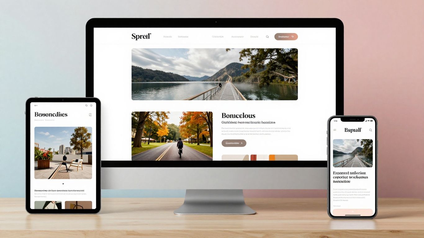
Responsive design is more than shrinking a desktop layout. It involves deciding what should remain prominent, what can move, and which interactions suit each screen. A component that works with a pointer may need a different arrangement when the primary input is touch.
We can build from content priorities rather than device stereotypes. Flexible grids, fluid type, and sensible breakpoints help the interface adapt as screens and browser windows change.
Reducing JavaScript and unnecessary page weight
Every script has a cost in download time, processing, and maintenance. We should ask whether a behaviour needs JavaScript at all, whether a dependency can be removed, and whether a feature can load only when it is needed. Simpler pages are often easier to debug as well as faster to use.
This does not mean removing useful interaction. It means reserving complexity for moments where it genuinely improves the task, instead of allowing small enhancements to accumulate unnoticed.
Connecting design decisions to Core Web Vitals
Core Web Vitals give teams a shared way to discuss loading, responsiveness, and visual stability. They do not replace user research or qualitative review, but they can reveal when a visual choice has created a measurable cost. A large hero image, late-loading font, or animated layout deserves attention when it affects the experience.
We can connect these signals to component decisions and page templates. That makes performance a repeatable part of the system rather than a last-minute technical rescue.
6. Trust and authenticity influence digital design
People judge a website by more than its polish. They look for signs that the organisation is clear about what it offers, how it operates, and what happens after an interaction. Honest content and careful interface decisions can make a modest design feel more credible than a flashy one that withholds useful information.
Showing transparent pricing, policies, and business information
Clear pricing and plain-language policies reduce uncertainty. Important conditions should not be hidden behind vague labels or placed several steps away from a decision. We can use hierarchy to make the main offer easy to understand while keeping supporting details close enough to inspect.
This approach also improves comparison. Visitors can see what is included, what may change, and where to ask for clarification before they commit time or information.
Using real photography, customer stories, and human details
Authentic details give a website a sense of place. Real photography, specific explanations, and carefully edited customer stories can make content feel grounded. The details should be accurate and relevant rather than added simply to create warmth.
Typography plays a role here too. A considered reading rhythm, useful captions, and direct language can communicate more humanity than a collection of stock images.
Designing privacy-conscious forms and consent experiences
Forms should ask only for information that serves a clear purpose. Labels need to explain what is required, why it is requested, and what happens next. Consent choices should be understandable and presented without pressure.
We can build trust by making optional fields genuinely optional and by offering a straightforward way to correct or withdraw information where appropriate. The interface should never make privacy feel like a punishment for continuing.
Avoiding dark patterns and manipulative interactions
A persuasive design is not automatically a respectful one. Forced continuity, confusing button labels, hidden costs, and difficult cancellation paths may increase short-term action while damaging confidence. We should make the honest choice easy to find, even when it is not the choice the organisation prefers.
A useful review asks whether a person would understand the outcome before selecting a control. If the answer is no, the interaction needs clearer wording or a better arrangement.
7. Sustainable and adaptable websites gain importance
Sustainability in web design is closely tied to restraint and longevity. A page that loads fewer resources, uses a durable system, and avoids unnecessary rebuilds can serve people more efficiently over time. We can consider environmental impact alongside accessibility, performance, and visual quality rather than treating it as a separate concern.
Reducing energy use through efficient page architecture
Efficient architecture starts with a clear content model and a careful loading strategy. We can reduce duplicate assets, avoid decorative media that adds little meaning, and serve only what a page needs. Static content, progressive enhancement, and sensible caching can also reduce repeated work for devices and servers.
The best opportunities often appear before visual polish begins. If the structure is focused, fewer components and fewer assets need to be maintained and delivered.
Creating flexible design systems for faster updates
A flexible design system helps teams make changes without rebuilding every page. Shared tokens, accessible components, and documented patterns provide a common foundation for typography, spacing, colour, and interaction. That consistency supports both speed and quality.
Flexibility does not mean allowing unlimited variation. Clear boundaries make it easier to update a site responsibly while preserving the parts people already understand.
Preparing layouts for new devices and interfaces
Websites will continue to appear across changing screen sizes, input methods, and browsing contexts. We can prepare by separating content from presentation, using semantic structure, and avoiding layouts that depend on one exact viewport. Components should have sensible behaviour when space, input, or orientation changes.
This kind of adaptability is more durable than designing for a predicted device. It gives the system room to respond without discarding its underlying logic.
Measuring whether a trend supports business goals
Not every popular technique belongs on every website. We should ask whether a change helps people understand, decide, complete a task, or return. If it adds maintenance, weight, or confusion without a clear benefit, it may be better left out.
A simple review can consider user feedback, task completion, accessibility findings, performance signals, and the effort required to maintain the pattern. Trends are useful starting points, but the right measure is whether the experience works better for the people who rely on it.
Conclusion
The most useful web design trends 2026 are less about collecting visual novelties and more about making digital experiences clear, responsive, expressive, and trustworthy. We can use AI carefully, motion purposefully, typography boldly, and design systems consistently while keeping accessibility and performance close to every decision. When a trend supports real user needs, it earns a place in the interface; when it does not, restraint is often the better design choice.
Frequently Asked Questions
What are the main web design trends for 2026?
The main shifts include more useful AI-assisted experiences, purposeful motion, richer visual expression, built-in accessibility, stronger performance practices, more transparent design, and websites designed for long-term adaptability.
How can we use AI without making a website confusing?
Keep familiar navigation and controls in place, explain when AI is contributing, provide ways to correct or dismiss suggestions, and maintain a dependable non-AI path for important tasks.
Is animation necessary for a modern website?
No. Animation should clarify change, guide attention, or provide feedback. If it distracts from content, slows the page, or creates difficulty for people who prefer reduced motion, it should be simplified or removed.
How do typography and visual expression affect usability?
Typography establishes hierarchy and reading comfort, while colour and composition influence attention. Expressive choices work best when they preserve contrast, readable line lengths, clear controls, and a predictable content order.
What should accessibility testing include?
Teams should test keyboard navigation, focus visibility, screen-reader structure, text resizing, colour contrast, form feedback, and reduced-motion behaviour. Automated tools can help identify issues, but manual review remains necessary.
Why does website performance matter to design?
Performance affects whether content appears promptly, controls respond reliably, and layouts remain stable. Design choices involving media, fonts, scripts, and animation can all influence that experience.
How can we decide whether a design trend is worth using?
Start with the user task and the organisation’s goals. Test whether the trend improves understanding or completion, then consider its accessibility, performance, maintenance needs, and behaviour across devices before adopting it.