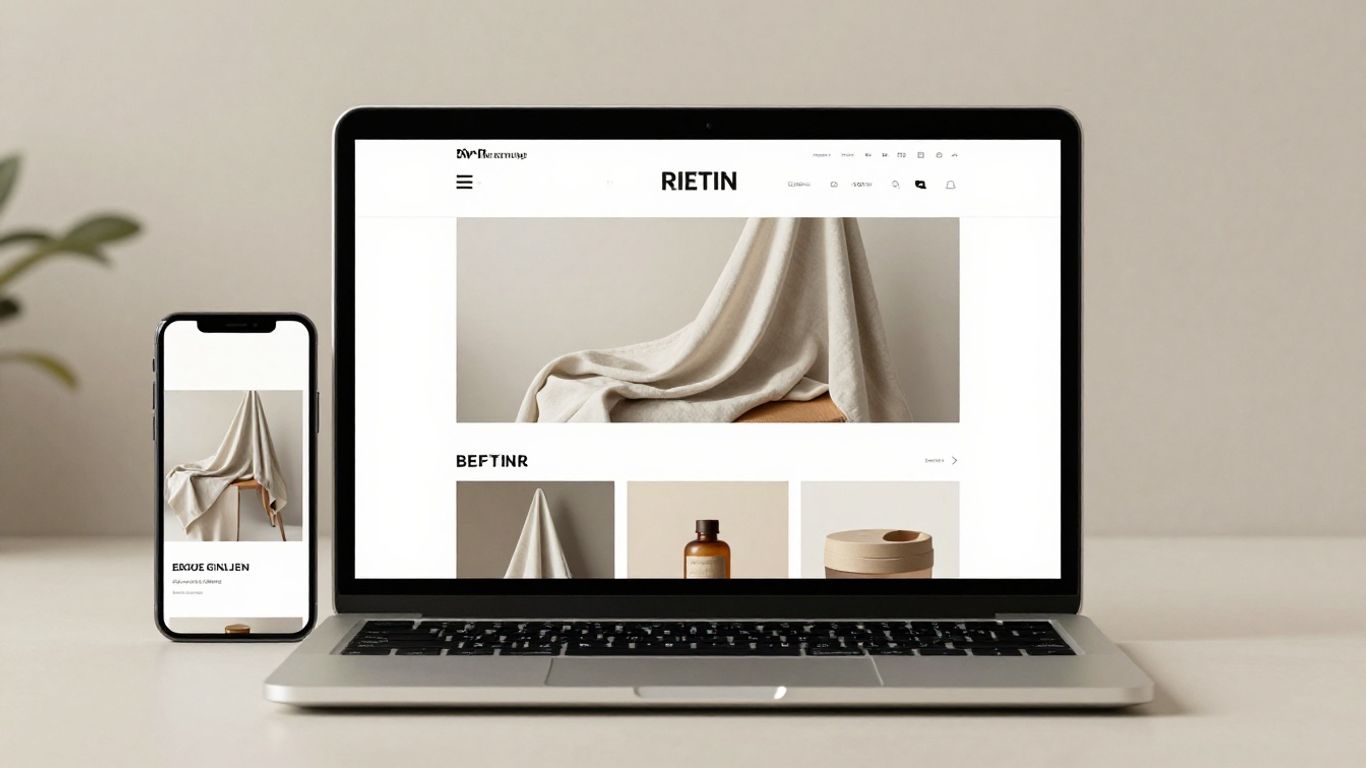
Web design trends 2026: What’s changing and how to apply it
AI-powered personalization without losing trust
Personalization can make a site feel more useful when it responds to what someone is trying to do, rather than simply displaying a different banner. But a tailored experience asks visitors to trust how their information is used. We can treat relevance and restraint as a pair: offer helpful choices, explain them plainly, and keep the experience easy to use without personalization.
Adapt content to user needs and context
A useful adaptation begins with a real user need. A returning visitor might appreciate seeing a recently viewed item, while someone arriving for the first time may need a clear introduction instead. We should avoid assuming that a single signal tells us everything about a person; context changes, and people often share devices or browse without a fixed goal.
We can start with small adjustments that make a page easier to navigate, then check whether they help people complete the task. For example, a team might consider whether to:
- Bring the most relevant next step into clearer view.
- Keep recently viewed material easy to find.
- Offer content choices without hiding the rest of the page.
- Let visitors change or dismiss a personalized suggestion.
These choices make adaptation feel like assistance rather than an imposed route. We should keep the original information accessible, so the interface remains understandable even when a suggestion misses the mark.
Make data collection and personalization transparent
People should not have to guess why a page is showing a particular recommendation. A concise explanation near the feature can say what is being used and how the visitor can adjust the experience. Clear controls matter as much as clear wording: a choice is not meaningful if it is difficult to find or reverse.
We can also make a useful distinction between personalization that relies on a visitor’s stated preferences and personalization based on observed behavior. The interface should describe its approach accurately, without burying important details in vague labels. When we make the process legible, people can decide whether the benefit is worth the information involved.
Keep human oversight in the design process
Automated variations still need a person to review them. We should look for outdated recommendations, unhelpful assumptions, and content that becomes confusing when presented in a new order. That review includes the whole journey, not just whether an individual component appears polished.
A practical review asks whether each variation preserves the same basic clarity and usefulness as the default experience. We can test edge cases, check that people can recover from an irrelevant suggestion, and decide when a simpler fixed layout is better. Human judgment keeps context in view while personalization changes the surface of a page.
Immersive interfaces that stay usable
Depth, movement, and spatial effects can give a digital experience more character, but they do not automatically make it more engaging. Each effect should help people understand an object, a relationship, or an action. When it competes with the content, it becomes decoration visitors must work around.
Use 3D and spatial effects to support the content
A three-dimensional view can help when shape, scale, or orientation is part of the decision a visitor needs to make. We can use depth to distinguish layers of information or make an object easier to inspect, while keeping essential details available in a straightforward format. The goal is not to turn every page into a simulated environment.
We should also consider what happens when a device cannot render the effect smoothly or a visitor chooses not to interact with it. A useful fallback preserves the same information and gives people a clear path forward. That way the visual treatment adds another way to understand the page without becoming the only way.
Add motion that clarifies interactions
Motion works best when it explains a change. A brief transition can show that a menu opened, a card moved, or a new state is now active. If an animation delays access to content or repeats without a purpose, it can make an otherwise simple task feel slower.
We can design motion around the action it supports: keep it short enough to follow, make the destination clear, and avoid using movement to conceal a change in page state. A quick prototype often reveals whether the animation improves orientation or merely draws attention to itself. We should judge it as part of the interaction, not as a flourish viewed in isolation.
Respect mobile performance and reduced-motion preferences
On a small screen, immersive effects have less room to breathe and can compete with scrolling, reading, and touch controls. We should test them on mobile early, not wait until the desktop experience is complete. People who prefer reduced motion also need a version that does not rely on animated transitions to explain how the interface works.
A considerate design keeps the action and its result clear when motion is reduced or unavailable. We can simplify or remove nonessential movement while preserving labels, state changes, and navigation. That lets the experience retain its character without asking every visitor to use it in exactly the same way.
Expressive typography and distinctive visual systems
Typography gives a website much of its voice before a visitor has read a full paragraph. Expressive type can create a strong first impression, but it still has to carry real content across different screens and reading conditions. We can build a distinctive system by pairing character with reliable hierarchy, spacing, and legibility.
Use variable fonts to create flexible visual hierarchies
Variable fonts allow a typeface to offer adjustable styles across a range of settings, which can help a design respond more fluidly to different roles and screen sizes. We should use that flexibility to establish clear relationships between headings, supporting text, and body copy, rather than changing every line simply because the controls are available.
A useful hierarchy makes it easy to scan a page and understand where to begin. We can test whether weight, width, or other available font settings improve that distinction while keeping smaller text comfortable to read. The type system should feel expressive, but its underlying roles need to remain consistent from page to page.
Make oversized type readable across screen sizes
Large headlines can set a strong visual pace, yet they often behave differently once a viewport narrows or the wording changes. We should check line breaks, spacing, and nearby controls at more than one screen size. A headline that looks striking in a design file may wrap awkwardly in the actual layout.
We can preserve the impact by adjusting scale and line length rather than shrinking text until it resembles ordinary body copy. Leave enough space for longer words and alternate languages if they are relevant to the site. The measure of success is not size alone; visitors should be able to read the headline without losing their place or missing the next action.
Build a recognizable identity beyond visual trends
A visual system becomes recognizable through repeated choices, not a single fashionable type treatment. We can define a restrained set of type roles, colors, spacing, and graphic details, then use them consistently across content. This makes room for personality without forcing every page to perform a new visual trick.
It also gives a team a steadier basis for future updates. If a trend no longer suits the site, its visual language can change without undoing the structure that helps people read and navigate. A distinct identity should remain recognizable in ordinary moments, including a plain article page or a compact mobile menu.
Modular layouts for flexible content
Web pages rarely stay still: headlines change, new content arrives, and the same information may need to work in several contexts. Modular layouts help a team make those changes without rebuilding every page from scratch. The trick is to make the system flexible enough for real variation while keeping its patterns familiar.
Arrange information in scannable grid-based compositions
A grid gives content a useful structure, but it should not dictate that every block has the same weight. We can use alignment and spacing to group related material, then vary the composition where the content calls for it. Clear visual groupings help visitors scan while leaving room for an occasional point of emphasis.
The reading order should stay obvious when a grid shifts between wide and narrow screens. We can check that related items remain together and that a change in placement does not create a confusing sequence. A good composition balances rhythm with a clear path through the information.
Design reusable components for evolving content
Reusable components work well when they capture a pattern that genuinely recurs, such as a title with supporting text or a card with a clear action. They become less helpful when every piece of content is forced into a shape that does not fit. We should define which parts can vary and which need to stay consistent, so editors can make ordinary updates without breaking the design.
A component library should make the intended use easy to understand. Clear names, sensible defaults, and examples of content variation help a team apply patterns consistently. Flexibility needs boundaries: when every detail can be changed, consistency becomes difficult to maintain.
Test layouts across devices and content lengths
A layout that works with short placeholder copy can fail as soon as a real headline wraps or a description runs long. We should test components with realistic content, including short and lengthy versions, so we can spot cramped cards, awkward gaps, and controls that drift out of place. Device testing reveals a different set of issues, especially when a multi-column composition becomes a narrow stack.
A small set of deliberate checks can make reviews more useful. We can examine a typical page, a page with unusually long content, and a narrow-screen version, then note which patterns need adjustment. That feedback helps us improve the component itself rather than applying a one-off patch to every page that uses it.
Accessibility as a baseline for richer experiences
Accessible design is not a separate layer we add after the visual work is finished. It shapes whether people can read, navigate, and understand the experience in the first place. When we build those needs into the initial system, richer visuals and interactions have a stronger foundation.
Maintain contrast and legible text
Text needs enough contrast against its background to remain clear, including when it appears over a photograph, gradient, or colored panel. We should check the combinations used across the interface, not just the main body text. Labels, captions, and text inside buttons deserve the same attention.
Legibility also depends on size, spacing, and line length. We can review real content at the sizes people will encounter, and avoid relying on color alone to distinguish important information. These choices help a page remain readable when someone is scanning quickly or viewing it under less-than-ideal conditions.
Support keyboard navigation and assistive technology
Every interactive control should have a clear purpose and a usable path to reach it. We should check that keyboard users can move through the page in a sensible order, identify where focus is, and activate controls without needing a pointer. A polished visual state is not enough if an essential action disappears during keyboard use.
Clear names and meaningful structure also help assistive technologies explain a page. We can make headings, links, and controls describe what they do, and ensure that changes in the interface are not communicated through appearance alone. When the visual and underlying structure agree, more people can orient themselves and complete the same task.
Test interactive patterns with diverse users
A pattern that seems obvious to its designers may be confusing to someone encountering it with a different device, habit, or access need. Testing with a range of people can reveal where an instruction is unclear, a control is hard to reach, or an interaction behaves differently than expected. We should pay attention to where participants hesitate, not only whether they eventually succeed.
We can use those observations to refine the pattern before repeating it throughout a site. When a design depends on an unusual gesture or hidden interaction, testing may show that a more direct option would be easier to discover. The aim is not to make every experience identical, but to avoid making access depend on guessing the designer’s intention.
Performance-conscious and sustainable design
Visual ambition comes with practical costs: images, animation, and external scripts all affect how a page behaves. A thoughtful design accounts for those costs early, rather than treating speed as a final engineering cleanup. That approach supports a more dependable experience and helps teams avoid shipping effects that add little value.
Optimize images, animation, and third-party scripts
We can begin by asking whether each large asset or moving effect is doing enough to justify its place. Images should be prepared for the role and dimensions in which they appear, while nonessential motion can be simplified. Third-party scripts deserve the same scrutiny: each one adds another dependency to a page and should have a clear reason to be there.
Small decisions accumulate across a site. Reusing a considered visual treatment, avoiding unnecessary decorative media, and limiting outside scripts can help keep pages leaner. We should preserve the details that improve understanding or identity, while trimming elements that mainly add weight.
Track Core Web Vitals during design and development
Core Web Vitals offer a way to discuss aspects of a page experience during design and development, rather than waiting for a vague impression of slowness after launch. We can use performance checks alongside visual review to see where a page may need attention. The results are most useful when we connect them to a specific page and the assets or patterns it uses.
Designers and developers can review the experience together as layouts, imagery, and interactions take shape. If a visual decision creates a performance concern, we can explore a more efficient version before it becomes difficult to change. This turns performance into a shared design constraint, not a surprise handed from one team to another.
Balance visual impact with efficient page experiences
A page does not need to be visually quiet to be efficient. It needs a clear reason for the resources it uses and a sensible fallback when a feature is unnecessary or unavailable. We can protect the important parts of the experience while reducing effects that compete with the content or slow down the path to it.
A useful review asks whether a visual choice helps people recognize, understand, or act. If it does, we can refine its implementation; if it does not, we can remove it without losing the page’s identity. This is a practical way to approach web design trends 2026: choose the parts that serve visitors, then make them work responsibly.
Conclusion
The most useful design trends are not the ones we apply everywhere, but the ones we adapt to a real audience and a clear purpose. When we balance personalization with trust, expressive visuals with usability, and modular systems with accessibility and performance, we can create websites that feel distinctive without becoming difficult to use.
Frequently Asked Questions
What are the main web design trends for 2026?
Common themes include more contextual personalization, purposeful 3D and motion, expressive typography, modular layouts, accessibility, and careful attention to performance. Their value depends on how well they support a site’s content and visitors.
How can we use personalization without making visitors uncomfortable?
Explain what personalization is doing, provide clear controls, and avoid collecting or using information without a clear purpose. Keep the main experience understandable even when a visitor does not want tailored content.
Do 3D effects belong on every website?
No. They are most useful when depth or perspective helps someone understand or inspect something. If an effect does not support the content, a simpler presentation may be clearer.
How do we make large typography work on mobile?
Test real headlines at narrow widths, check line breaks and spacing, and adjust the scale so text remains readable. Make sure the headline does not crowd nearby content or controls.
What makes a modular layout effective?
An effective modular layout uses recurring patterns where they help, while allowing content to vary when needed. Testing with realistic text and different screen sizes helps reveal where a component is too rigid.
Why should accessibility be considered early in a design project?
Early attention to contrast, text, keyboard use, and assistive technology helps shape patterns that work for more people from the start. It can also prevent costly changes after a system has been repeated across many pages.
How can we keep a visually rich website fast?
Choose images and animation for a clear purpose, optimize assets for their use, and review third-party scripts carefully. Test page performance as the design develops so concerns can be addressed before launch.